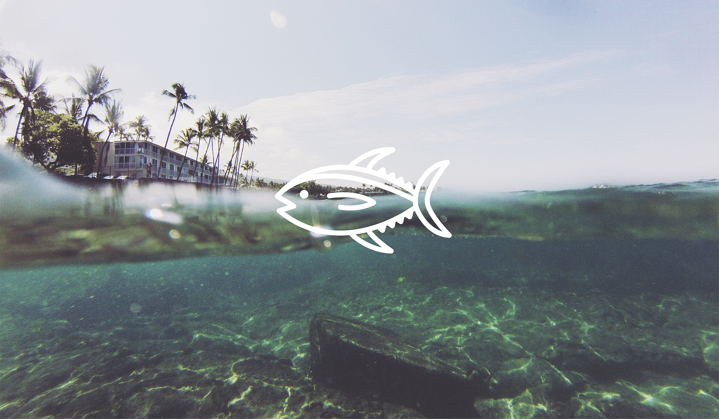
The internet is rife with so many cliché and corny “Hawai’i” themed iconography. There are some exceptions but for the most part they are all so ordinary and familiar that they’ve become dull or almost routine. It’s somewhat inaccurate in fact, to depict a generalized version of Hawai’i when there are so many different, complex, and intriguing aspects to portray.
I wanted to create a set of icons that were a more authentic representation of Hawai’i—showcasing real attributes and significant peculiarities of the culture. This is just a small slice of icon designs I’ve collected so far. I intend to continue making these until I have a comprehensive, all-encompassing assortment of icons that will later be shared with the world. \m/
Dynacraft is one of the leading sellers of bicycles on the planet. Fresh outta college I worked here as a Production Artist. I was responsible for product photography and the production of packaging for bicycles, scooters, and other licensed products. I used design elements provided by licensing companies to create compelling package designs. Additional responsibilities included creating the production and design of instruction manuals for their products. The work consisted of page layout, typography, and a good deal of illustration.
I once thought about how the Golden Gate Bridge would look if it were a cat. I think it would look like this.
In early 2020, I moved from the Outer Sunset to the Inner Richmond neighborhood in San Francisco. The contrast in their names and environments inspired me to create this graphic.
Behold the different hill bomb routes of Twin Peaks. A somewhat accurate guide from the very top all the way down to Market and Castro.
Product collateral was in my wheelhouse while at Royal Robbins. Every Spring and Fall, a new batch of 30-50 hang tags needed to be designed. Using copy from the product team and e-commerce manager, I flowed text and icons onto tags. The really fun task was designing tags for featured products like the Ultimate Travel Jacket. I enjoyed the challenge of creating a compelling, informative design, which showcased all features (and fit with French translations).
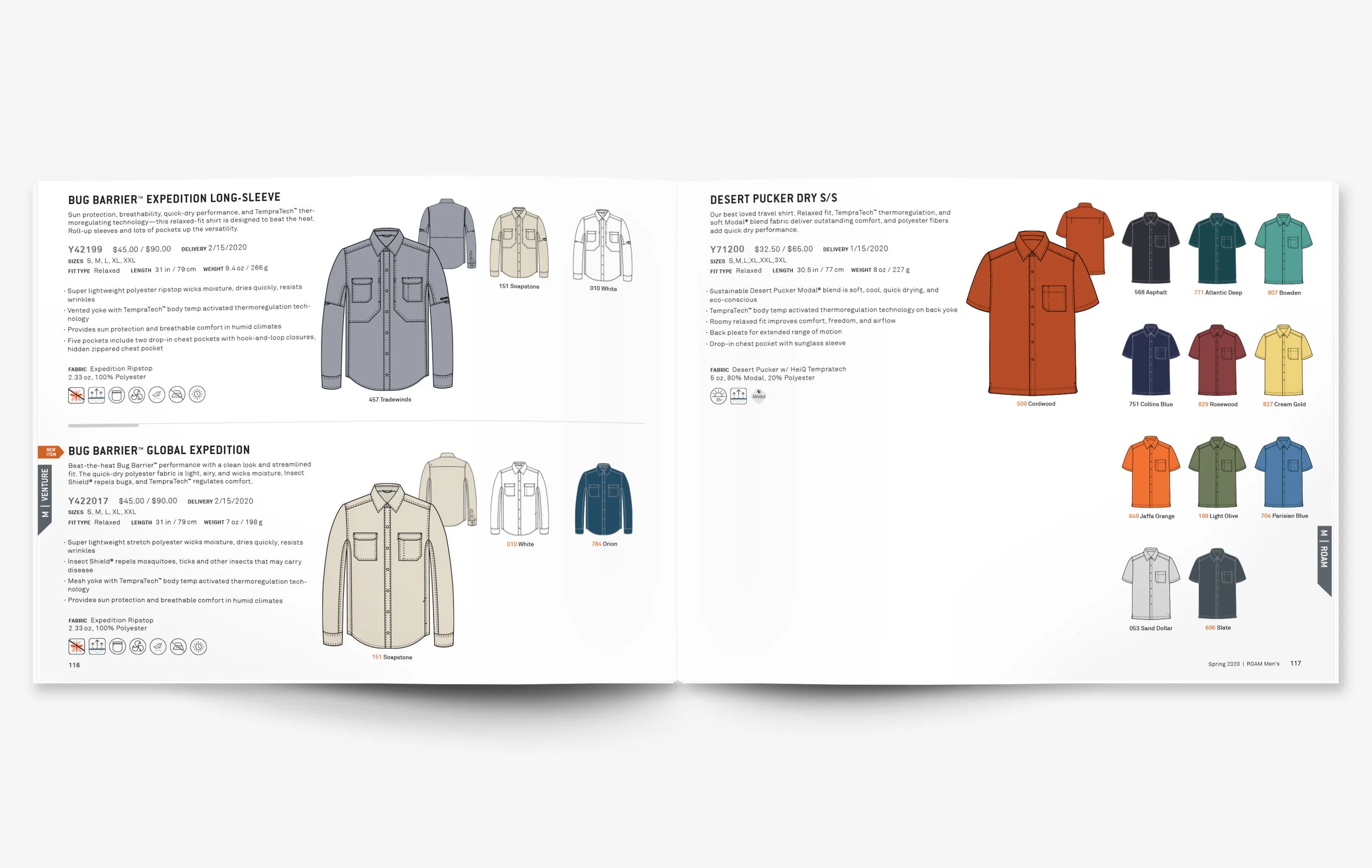
A big part of my role at Royal Robbins was managing the production and design of their seasonal workbooks. These books are selling tools for the sales reps and contain all information about each product for the specific season. Below is a layout I’ve created to house all information in an efficient and aesthetically pleasing way for the Spring 2020 workbook.
Royal Robbins’ parent company Fenix Outdoor, owner of leading european outdoor specialty retail stores Globetrotter, Friluftsland, Naturkompaniet, and Partioaitta, invested a lot in RR by showcasing product in the windows of 20+ outdoor stores around select cities in Europe. I took on the duty of designing and supplying print ready assets for this project, working with european Marketing Coordinator stationed in Sweden to collaborate, plan, and execute the specifics of window arrangement. Artwork and RR product was displayed from March - June 2019 in outdoor store windows located in Germany, Sweden, Finland, and Denmark.
I was responsible for the production and design of Royal Robbins’ hang tags for multiple seasons. With roughly 30-50 new tags each season, I enjoyed the challenge of making the design work in the relatively small space.
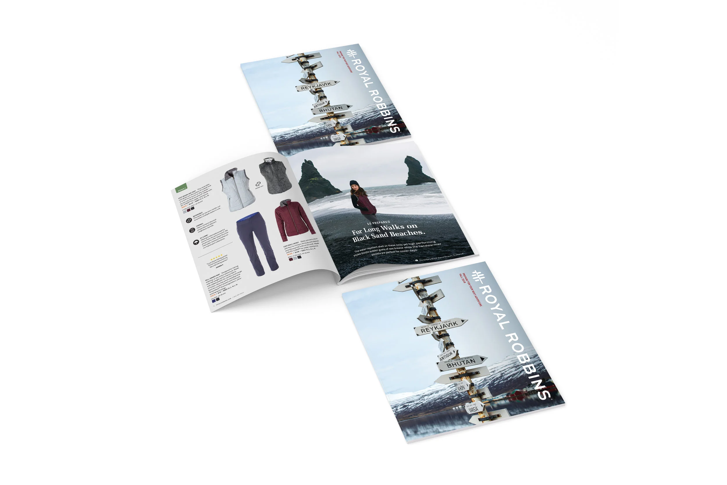
Definitely an exciting opportunity to handle the production and design of Royal Robbins’ fall-winter 2018 catalog.
A big part of my role at Royal Robbins was managing the production and design of seasonal workbooks. These books are selling tools for sales reps and contain all information about each product for the season. Below is a layout I’ve created to house all information in an efficient and aesthetically pleasing way.
While working for Dynacraft, I worked on layout and design of instruction manuals for their bicycles, scooters, and special products. The work consisted of page layout and typography work, but also a good deal of illustration.
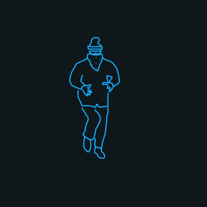
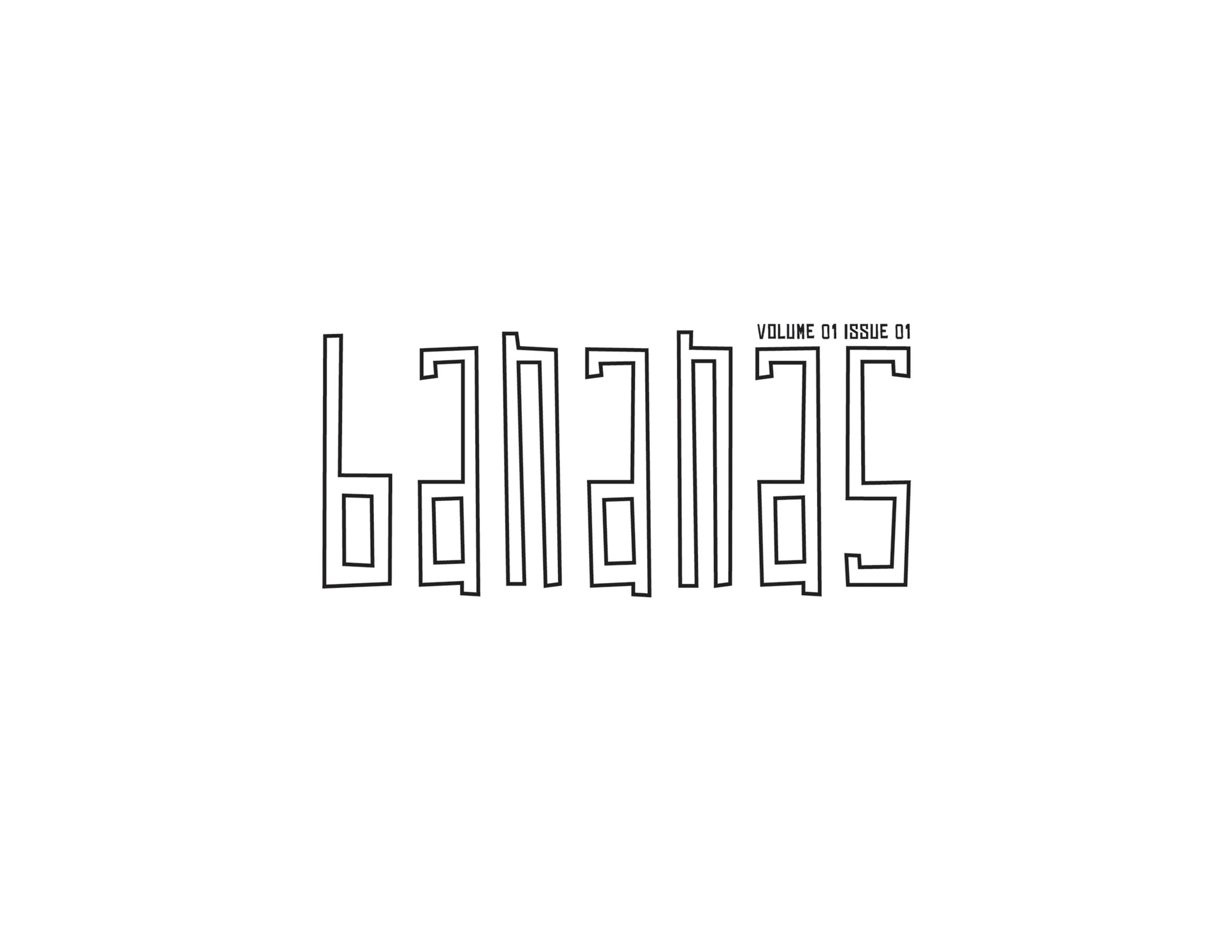
Bananas Magazine is a zine, with only one issue ever printed. It’s an array of colorful and provocative articles, meant to lure and shock its readers with off-the-wall content.
Sed vitae enim egestas, congue arcu et, efficitur augue. Cras sit amet venenatis est. Sed pulvinar sodales lacus sit amet placerat. Nulla facilisi. Integer pellentesque semper magna vel pellentesque. Cras imperdiet tortor sit amet erat aliquet rutrum.
Chosen by Central Market Community Benefit District in an effort to celebrate the streets of its neighborhood, these streetlamp banners exemplify the flamboyant inhabitants and theatrical culture of the area.
What started out as a few doodles turned into a full-fledged print job project. “What You Do to Me” is a collection of cards that illustrate common turns of phrase when you find yourself smitten. The plan is to mass-produce them in the near future ;)
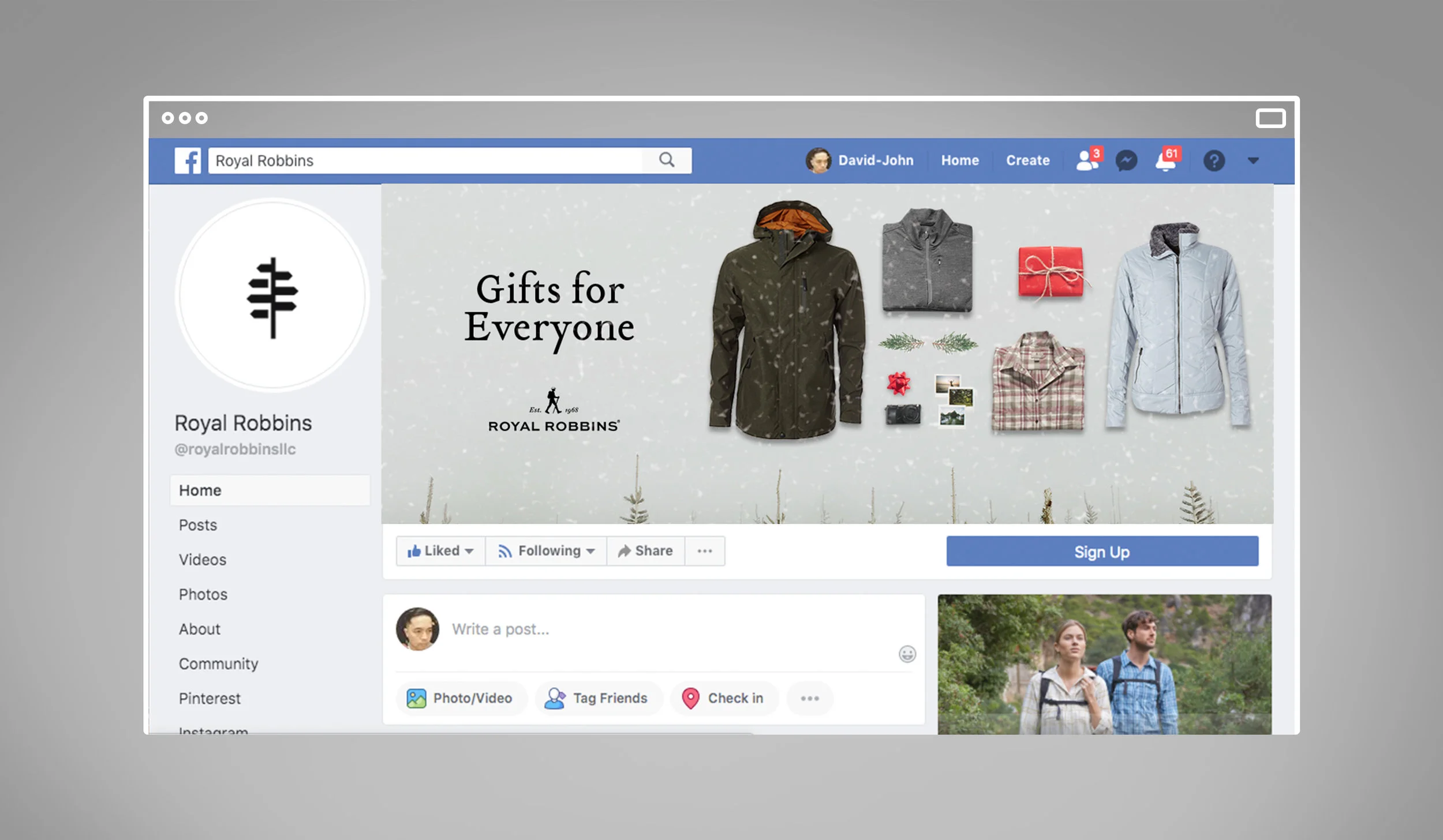
I created a ton of display ads for Royal Robbins. We worked with a digital marketing firm to launch weekly ads for all types of sales, events, and messaging.
I had the opportunity to design a few landing pages while at Royal Robbins. The first one is for their new website relaunch. Some elements are used till this day on their site. The second one was designed to be a guide, to explain the ins and outs of their bottoms fits, which was online for a number of years.
I also handled the email design for Royal Robbins. A combination of photoshop and Mail Chimp were used to create these newsletters. We launched 2-3 emails per week.
My very first design job (while still in school) was for a creative online and mobile photo sharing app called ImageChef. It was so much fun creating the content for this app and website. I created unique photo frames and text templates for people to customize their photos and share with their friends.
At Dynacraft, I was responsible for the production of packaging for bicycles, scooters, and other licensed products. I used design elements provided by licensing company as well as product photography skills to create compelling box designs.
I also handled decal mechanicals for bicycles and scooters. I would resize, adjust, and test decal artwork to fit specific locations on the bikes and scooters.
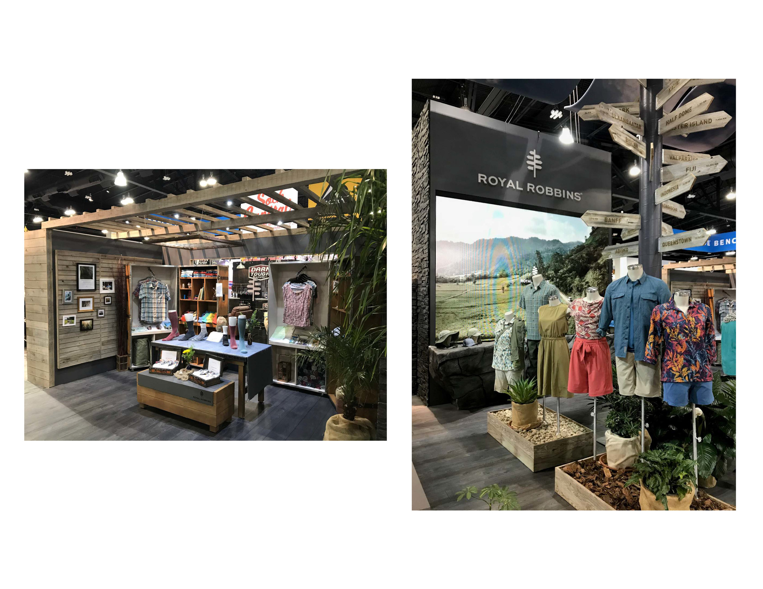
Twice a year I would be responsible for Royal Robbins’ design and execution of exterior and interior trade show booth graphics for Outdoor Retailer expo in Denver CO. This season’s themes were “adventure travel” and “sustainable hemp”.
This is the “adventure travel” themed tower, designed with ancient temple ruins. This back-drop imagery is meant to represent the type of environment in which the clothes on mannequins would be best suited for.
This tower is all about showing off the benefits of hemp. The direction given was to go not overtly “pot” with the imagery, but still intriguingly hemp. All items on mannequins are hemp-based products. Props are used to complete the display.
The below interior booth display is aimed at promoting Royal Robbins’ new hemp travel sock collection and Spring 2020 line.
Every 6 months Royal Robbins produced new point of sale display artwork. I oversaw and drove the design and print production of their entire set. One set includes posters, logo signage, and multiple sizes of signage.